
AIMstone Partners has a facelift!
In today’s competitive business landscape, brand identity is more than just a logo; it’s the way a company presents itself to the world. That’s why AIMstone Partners, a prominent player in the consulting and financial services industry, decided to refresh its brand image, transforming into the streamlined, sophisticated “AIMstone.” They chose the creative talents of CharlieMike and Wolf&Hat Studio to help them achieve this rebranding vision. Together, we crafted a new logo, branding style, typefaces, colour palette, and a fresh WordPress website that captures AIMstone's modern approach.
Here’s a behind-the-scenes look at how this exciting collaboration came together and what went into AIMstone’s rebranding journey.
The Vision: A Fresh Identity for a Trusted Brand
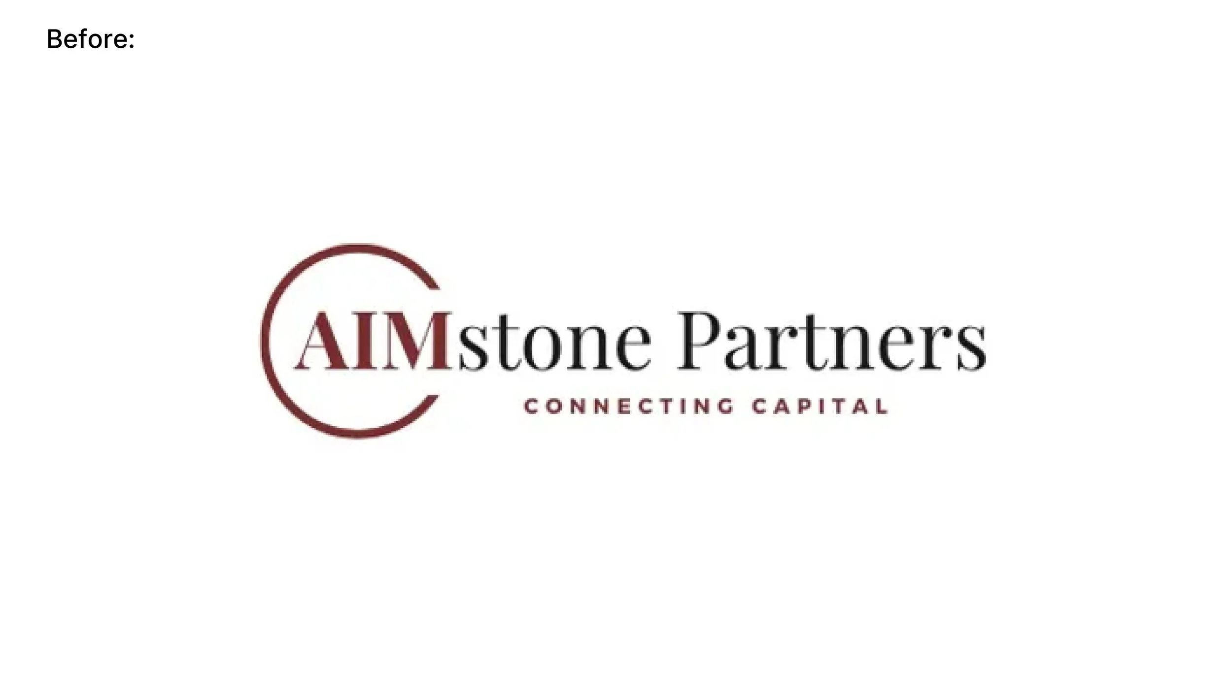
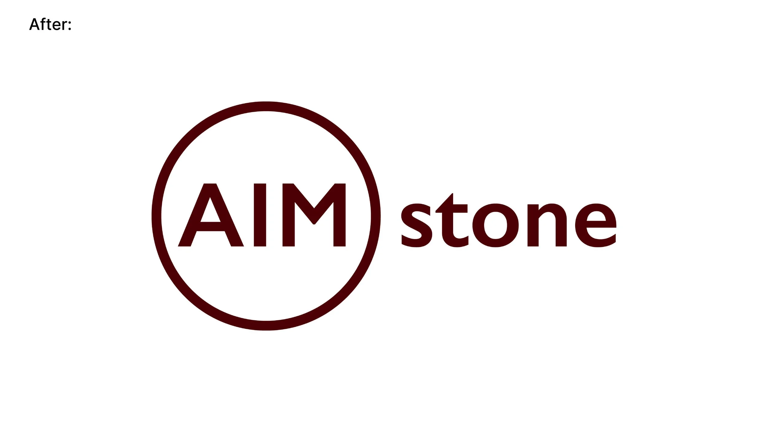
AIMstone Partners wanted a shift in identity that would reflect both its strong legacy and its forward-thinking approach. The goal was to shed the “Partners” from the name, emphasising simplicity and directness with just “AIMstone.” This shift not only shortened the name but also modernised it, giving it a sleek, memorable feel.
This is where CharlieMike and Wolf&Hat Studio stepped in. By combining our design expertise and strategic approach, we set out to create a new brand identity that would be professional, approachable, and distinctive.
Step One: Building a Strong Brand Foundation
Logo Design: Where It All Begins
Creating AIMstone's new logo was our first big task. We aimed to design a symbol that was visually clean and instantly recognizable. The logo had to reflect AIMstone’s commitment to clarity and strength. After a few rounds of brainstorming and conceptual sketches, we landed on a minimalist design that combines stability with elegance—attributes that perfectly align with AIMstone’s values.
The logo’s simplicity is both modern and timeless, designed to stand out in both digital and print environments. Whether on a business card or a large office display, the new logo creates a professional impression that’s clean and memorable.
Color Palette: Defining the Brand’s Visual Tone
Next, we developed a color palette that would visually support AIMstone’s personality and the fresh direction they wanted. We chose a modern yet versatile color scheme—one that’s vibrant enough to be eye-catching yet muted enough to convey professionalism. By blending deep blues with warm neutrals, we crafted a palette that evokes trust, reliability, and a sense of approachability.
These colors set the tone for AIMstone’s presence across all media, helping them stand out in a traditionally conservative industry while still conveying credibility.
Typography: Making the Brand Speak
The right typeface is a subtle but powerful part of branding. For AIMstone, we wanted typography that balanced elegance and modernity. Our team chose a sans-serif font with clean lines and an approachable feel. This typeface is easy to read and brings a sense of confidence to every message AIMstone shares. The chosen typography works seamlessly across all formats—from their website to their presentations—ensuring consistent and professional communication.
Step Two: Bringing the Brand to Life Online
The New WordPress Website: AIMstone’s Digital Hub
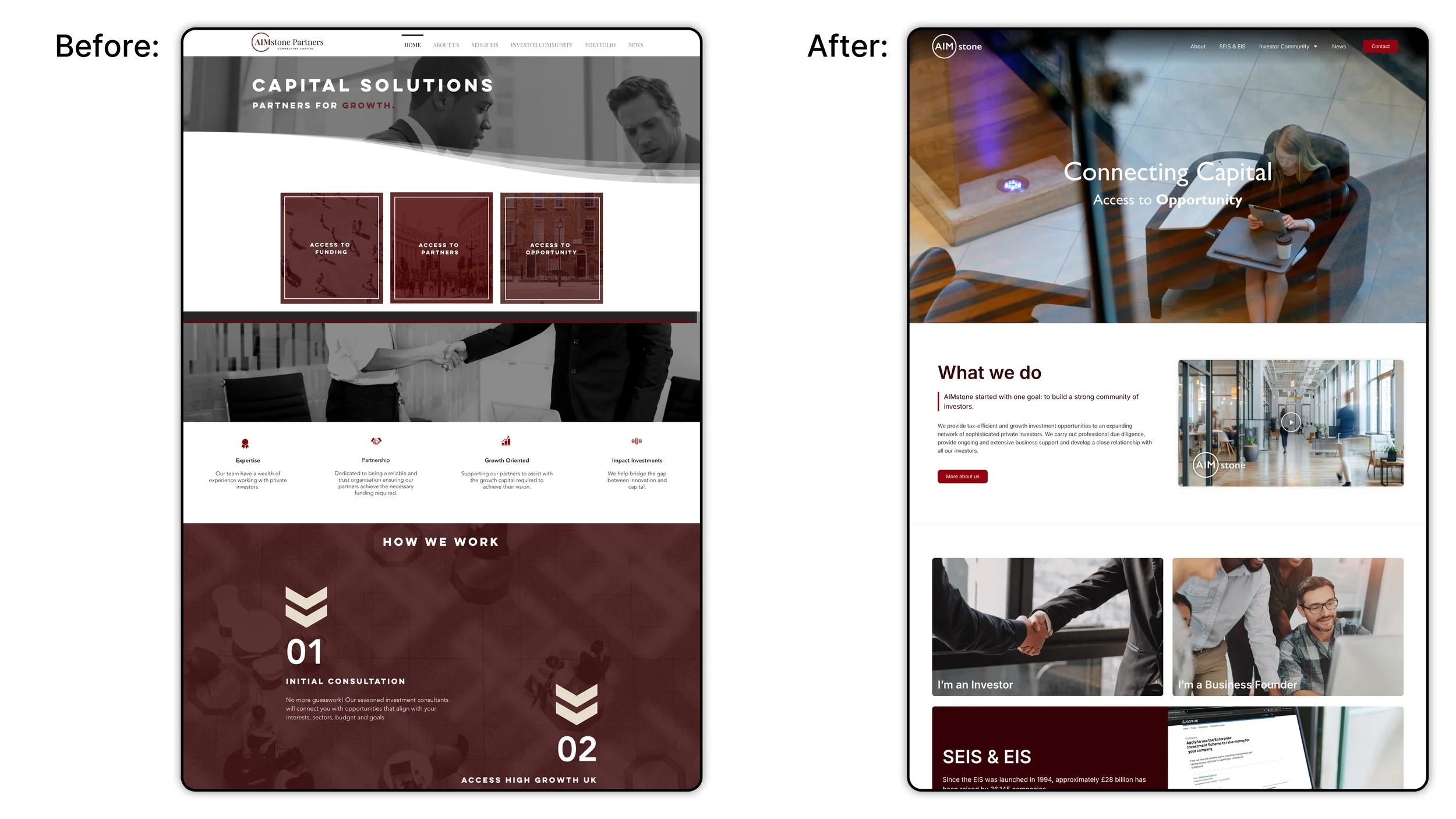
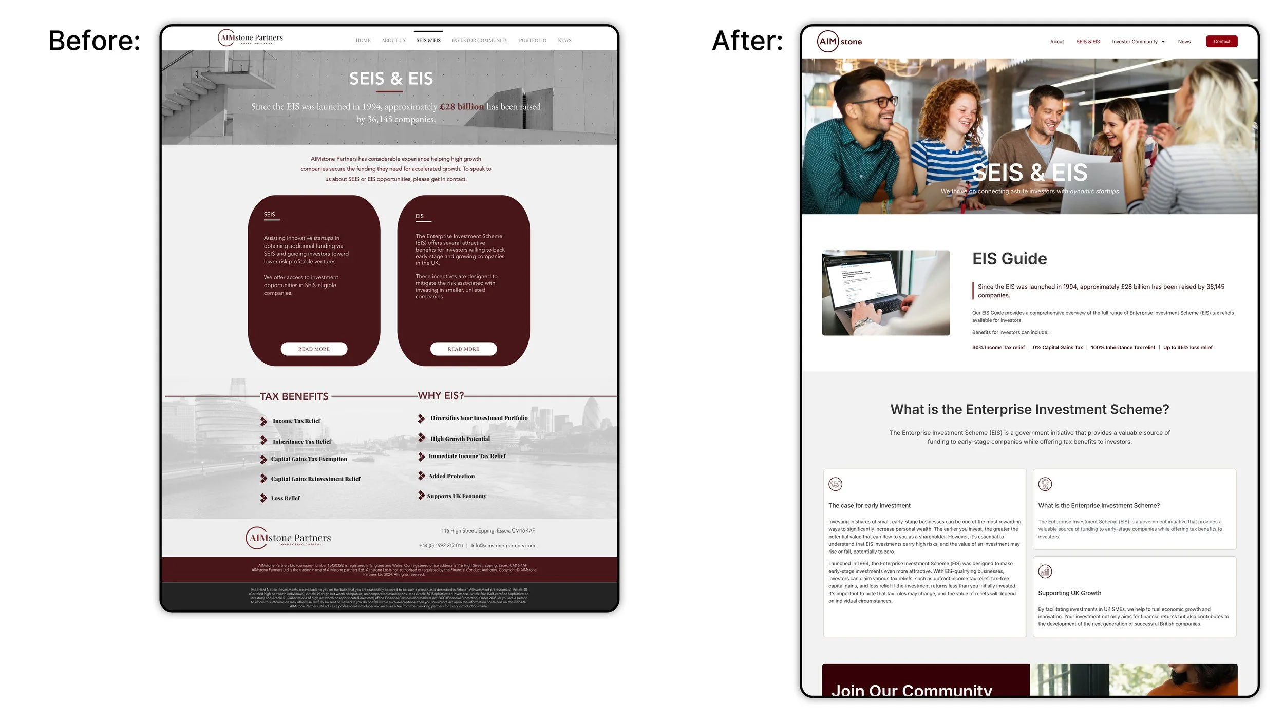
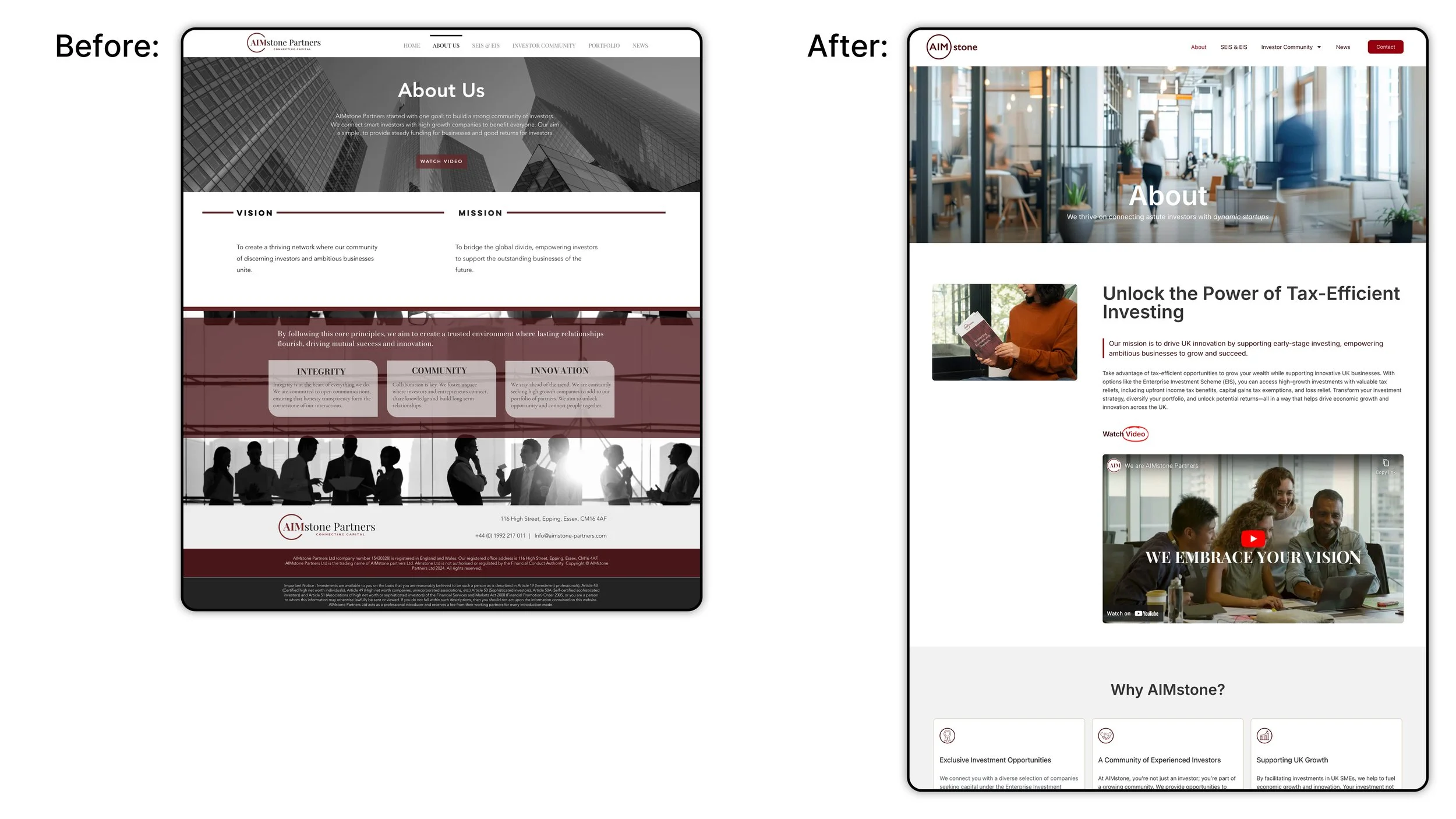
A rebrand isn’t complete without a solid digital presence, and AIMstone’s website was a key part of this transformation. We built a sleek, responsive WordPress site designed to engage and inform visitors from the very first click. The new site design integrates the updated logo, colors, and typography for a cohesive look that’s in line with AIMstone’s modern brand identity.
To ensure the site was as user-friendly as possible, we streamlined the navigation, making it easy for visitors to find what they need without unnecessary clicks. From potential clients seeking services to industry partners looking for information, everyone who visits the site will experience AIMstone's new, professional image.
The Outcome: A Cohesive, Modern Identity
The result of this collaboration is a brand identity that’s streamlined, sophisticated, and ready for the future. AIMstone now has a brand that reflects its strengths and goals, along with a website that enhances its online presence.
Working together, CharlieMike and Wolf&Hat Studio were able to elevate AIMstone’s brand to new heights, creating a cohesive and modern identity that truly represents who they are today. With a logo that stands out, a color palette that resonates, and a typeface that speaks with confidence, AIMstone is now positioned to attract and inspire both existing and future clients.
Final Thoughts
Branding is more than just visuals; it’s about creating a story and a personality that people can connect with. AIMstone’s rebranding is a testament to the power of collaboration and creativity. By teaming up, CharlieMike and Wolf&Hat Studio delivered a brand identity that not only looks fantastic but also supports AIMstone’s goals for growth and innovation.
If you’re interested in refreshing your own brand, reach out! Let’s create something remarkable together.